Every week, teams across organizations spend hours building dashboards, preparing reports, and crafting presentations. Yet the data they share rarely drives the decisions it was meant to inform. Audiences glance, nod, and move on. The insights get lost. The question isn’t whether your data matters — it’s whether your visualizations are actually communicating it.
Two deceptively simple principles, declutter and focus, can change that. Backed by a growing body of empirical research and decades of practitioner wisdom, these two design strategies form the foundation of effective data communication.
The Problem With Business-As-Usual Charts
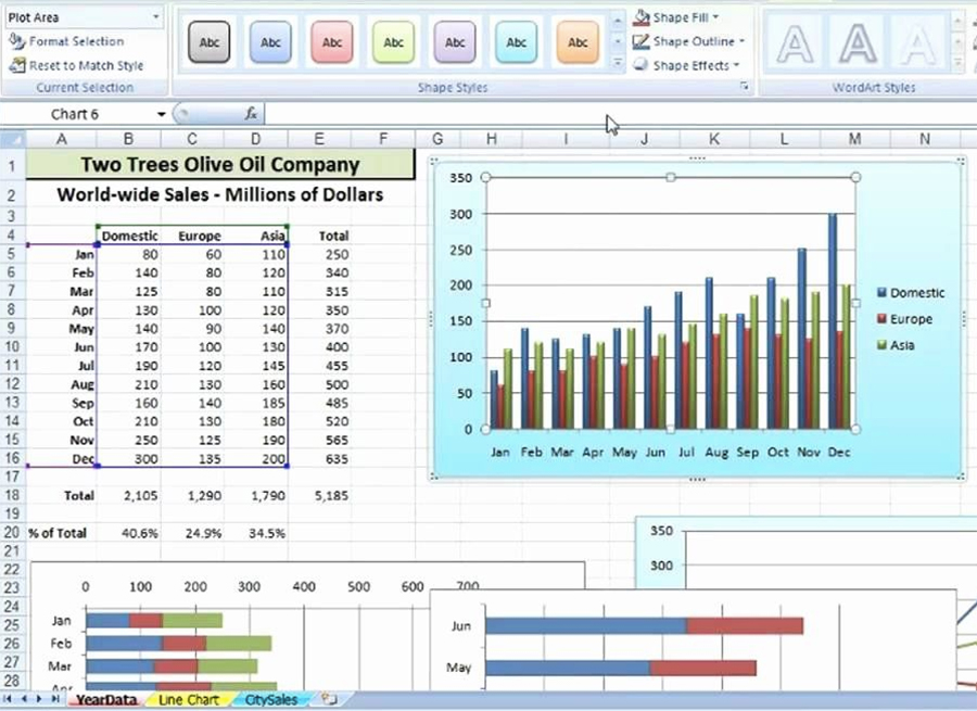
Open any default Excel chart. You’ll likely find a rainbow of colors, thick gridlines, diagonal axis labels, heavy borders, redundant legends, and a title that describes the data but tells you nothing about what it means. These aren’t stylistic preferences — they are visual noise that competes with the message you’re trying to send.
Edward Tufte, whose landmark work The Visual Display of Quantitative Information remains essential reading for anyone working with data, introduced the concept of the “data-ink ratio” — the idea that every element in a chart should earn its place by contributing to comprehension. Anything that doesn’t is treated as noise, therefore remove it. Alberto Cairo, in The Functional Art, extends this principle by reminding us that visualization is fundamentally a tool for cognition: its purpose is to help people think, not to impress them with complexity.
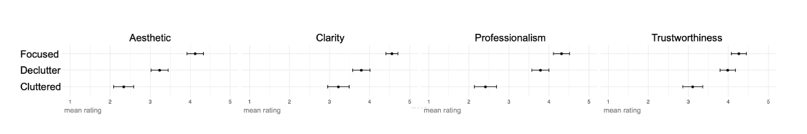
A recent empirical study by Ajani and colleagues confirms what practitioners have long argued: cluttered charts receive lower ratings for professionalism, aesthetics, and clarity. More importantly, audiences struggle to extract the intended message from them.
Step One: Declutter
Decluttering means removing the elements that add visual weight without adding understanding. In practice, this translates to eliminating unnecessary gridlines, reducing color variety, replacing diagonal text with horizontal labels, converting legends into direct data labels, and adding generous white space around your chart elements.
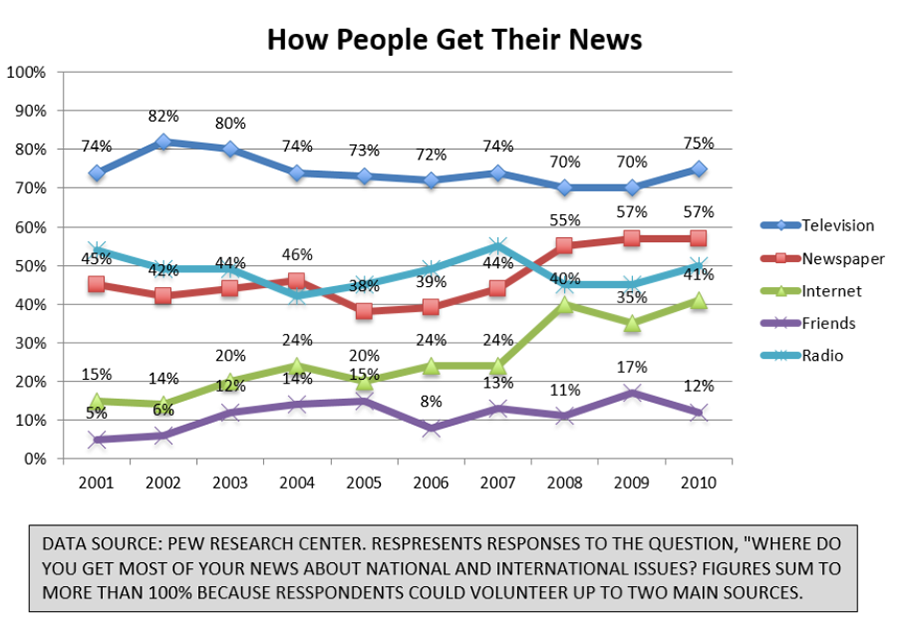
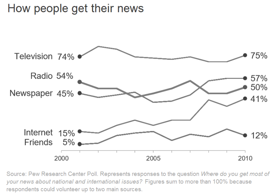
Consider a line chart comparing internet usage trends across five media channels over fifteen years. A cluttered version might use five different colors, a dense grid, multiple bold text styles, and a legend in the corner. A decluttered version of the same data uses a neutral gray palette, removes the grid entirely (or softens it significantly), and labels each line directly at its endpoint. The data itself becomes the visual anchor.
Scott Berinato, in Good Charts from Harvard Business Review Press, draws a useful distinction between exploratory and explanatory visualization. Exploratory charts are for you — they help you find the story. Explanatory charts are for your audience — they communicate that story. Clutter might feel informative during exploration, but it becomes a barrier during explanation. Decluttering is the transition between those two modes.
What the research shows is nuanced: decluttered charts don’t dramatically improve recall of individual data points, but they consistently earn higher professional ratings and reduce the cognitive friction viewers experience. That reduction matters in a meeting room or on a dashboard where your audience has fifteen seconds and limited patience.
Step Two: Focus
Decluttering removes what shouldn’t be there. Focusing adds what needs to be there — a clear, directed signal about what the audience should notice and remember.
The focus principle combines three elements: a headline that states a conclusion (not just a topic), a highlight color applied to the data pattern that supports that conclusion, and a brief annotation that connects the visual to the business context, like in this example from The Data Visualization Society.
RJ Andrews, in Info We Trust, describes this as building trust with your reader — not by showing all the data, but by guiding them through it with intention and clarity. A focused visualization says: “Here is what matters, here is why, and here is where you can see it.”
The empirical impact of this approach is striking. In controlled experiments, viewers who saw focused visualizations were nearly three times more likely to recall the intended conclusion compared to those who saw decluttered-only or cluttered versions. When asked to redraw charts from memory, participants who saw focused designs reproduced the highlighted trend far more accurately.
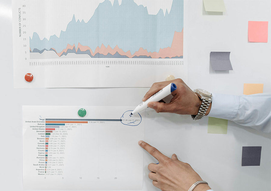
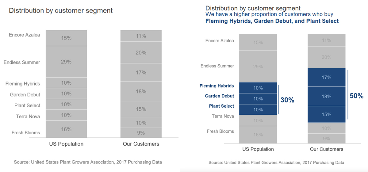
Here is another example of what this looks like in practice. Imagine a horizontal bar chart showing customer distribution across seven flower seed brands, comparing your local store’s sales to national figures. A cluttered version uses a color for each brand and provides no narrative. A focused version uses gray for all bars except the three brands that over-index locally versus nationally, adds a headline stating “Three local brands significantly outperform their national share,” and includes a single annotation pointing to the divergence. Viewers walk away knowing exactly what the chart means — and they remember it.
An Honest Look at the Tradeoffs
It would be dishonest to present these guidelines as universal rules without exception. The research also surfaces a few important caveats.
Some audiences, particularly those accustomed to dense analytical tools, may initially perceive decluttered charts as lacking rigor or even “boring.” Familiarity plays a role in how professional a chart feels, and in certain organizational cultures, the absence of gridlines can feel like oversimplification. The solution is not to abandon the principles but to apply them with contextual judgment.
The focus technique also carries its own risk. A small number of participants in the research flagged focused charts as feeling “pushy” or agenda-driven — as though they were being told what to think. This is a legitimate concern. Focusing works best in explanatory contexts where you have identified the insight and are communicating it to a specific audience. In exploratory or analytical contexts, where the goal is discovery or group discussion, preserving visual complexity may actually serve the conversation better.
Gridlines are also worth revisiting on a case-by-case basis. When precision matters — when viewers need to compare values far from an axis — a soft, low-contrast gridline earns its place. The goal is never minimalism for its own sake, but clarity in service of the message.
How to Start
The most practical entry point is your next chart — before you publish it. Run it through three questions:
- Does every element here help my audience understand something?
- Have I stated the conclusion in the title, not just the topic?
- Is there one data pattern I want them to remember — and have I made it visually distinct?
If you answer no to any of these, you have a clear path forward on where to start.
Closing Perspective
In my work helping organizations transform how they communicate data — through visualization design, consulting, and training — I have seen the same pattern repeatedly: the teams who make the biggest impact with their data are not the ones with the most sophisticated analytics. They are the ones who have learned to edit ruthlessly and communicate with intention.
Declutter and focus are not stylistic preferences. They are strategic choices — ones that signal to your audience that you understand your data well enough to distill it.
Before your next presentation, ask yourself: if your audience walked away remembering just one thing, what would you want it to be? Have you made that unmistakably clear?
Do you want to improve your chart design skills?
Check out our comprehensive training programs on our learn page,
or contact us to discuss customized corporate training solutions.
Related Posts

Six Essential Elements to Create Successful Data Stories in Tableau
Organizations generate more information than ever before. Yet despite having access to…

Exploring Data Analysis and Visualization with AI
Extracting meaningful insights from visual data is crucial to businesses. Artificial Intelligence…

Why Tableau Desktop Remains the Premier Choice for Data Visualization
1. The Data Visualization Imperative In today’s data-driven landscape, the ability to…